• May 14, 2015, 10:17 p.m.

    ODO is looking for new artwork and contributions towards making our new website look great. 😀
    Because these are fully custom forums, we can change pretty much anything and everything - the sky is the limit! 🤓

    [center]We are asking for ideas and artwork from you guys and gals about what we should do.[/center]

    This could be in the form of artwork for icons, backgrounds, headers or rank symbols, it could be a different colour scheme and layout, it could be something else entirely.

    In terms of design, there are a few things which you might like to consider:
    As a cabal, we have recently moved (officially) to a round table structure of administration, rather than having one supreme leader who had the final word. [/:m]
    We want to keep stuff light, rather than going all dark and moody all the time. Obviously some dark elements are great, but we'd like to be moving into the light![/:m]
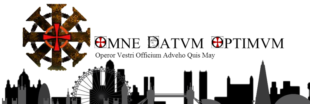
    We are modern Templars. Obviously we should acknowledge our roots, but they aren't necessarily the be all and end all. It would be nice to reflect this modern aspect in some way maybe 🙂
    ODO does a lot of different things and working out a way to incorporate that into a theme might be interesting.[/
    :m]
    Finally, you should be aware that whilst the website will allow us to change anything, there may be issues with us working out exactly how to do it! Incredibly complicated stuff can (probably) be done, but we may need help working out exactly how to implement it! If you are familiar with phpBB code and/or the EQDKP plug in, your help would be greatly appreciated![/:m][/list:u]

    Your kind submissions will be rewarded 😀 I don't want to go too far into specifics while I work them out, but we will be giving out tokens of our appreciation in the game 🙂

    Depending on the number of submissions that we get, we will then decide which we want to take forwards. If any designs particularly appeal to you, please do let us know 🙂

    In terms of how best to submit artwork, at the moment we are asking people to upload their images onto an online viewer (i use photobucket.com, there are a massive number of alternatives out there!) which you can then link in a forum post. If it's a different type of file, then a link to an ftp or dropbox (or something) would be great.

    [center]So now, it's over to you! 😀[/center]

  • Retired 12 posts
    May 17, 2015, 5:45 p.m.

    If Hollow and I are the only 2 interested I think they two of us could work together to make some awesome stuff. Just sayin'.

  • Retired 920 posts
    May 17, 2015, 5:58 p.m.

    We do not know yet, as if people have not heard about it before or yet, probably need time to prepare something. But if you guys want to team up, by all means go ahead 😀

  • Retired 12 posts
    May 18, 2015, 5:19 p.m.

    When is the deadline for submissions? Time boxing this would be helpful.

  • Retired 156 posts
    May 18, 2015, 7:33 p.m.

    Sure Aerilon we can work out something 🙂 We can take things to private message to work out general formats and variations.

  • May 18, 2015, 9:16 p.m.

    There is no set deadline for this, and I don't think we're going to be making any decisions too soon.
    The two of you have got a jump on this, having started doing stuff before the brief was even announced. We need to give people who have only just heard about it time to do their own thing.

  • Retired 143 posts
    May 19, 2015, 4 a.m.

    So, Templar's mean shields, dragons, swords, knights, roundtable, lions BUUUUUT with a modern twist. Is that what we were going for... think so. Aerilon that ODO wording is awesome 🙂

  • Retired 12 posts
    May 19, 2015, 5:09 p.m.

    Thanks I wanted to really go for a clean look and feel. All to often guild sites get bogged down by graphics. I wanted to design something that was simple and elegant and that could easily scale to mobile devices since its important that people be able to access the site from their smartphones and tablets.

  • May 19, 2015, 6:16 p.m.

    I think there's a line to draw somewhere in between. We don't want a site which drowns a user in graphics and has overly complicated stuff, but on the other hand, we don't want to go too minimal, or the pages look too Spartan and empty.
    We'll see what designs we get, then take a view on how to proceed 🙂

  • Retired 12 posts
    May 19, 2015, 6:28 p.m.

    How responsive is this platform to mobile devices? That makes a huge difference in design.

  • Retired 920 posts
    May 19, 2015, 7:11 p.m.

    It's somewhat responsive, but it's better to go with 2 templates, we can define one for desktops and one for handheld. Responsiveness stumbles as it's limited to showing or hiding elements depending on if it's handheld or not, but not every element got it nailed down. Grab me on TS and we can talk more in depth about the structure.

    On personal preference I also think that most responsive designs leave desktop experience lacking, exception being pure information sites like blogs and news. As far as using sites goes I prefer the way twitter and facebook did it where mobile page is design around handhelds and ideal use, while desktop versions are designed with big screen and mouse in mind. Not that desktop experience of our site is that great, I would have/will redesigned it a fair bit, but due to time and coding skills my deadlines are measured on geological scale.

  • Retired 12 posts
    May 19, 2015, 8:22 p.m.

    That makes sense. Most of the sites I've developed used WordPress as a foundational platform just because it is more designer-centric. Poorly designed sites dont scale well between the two, but it is achievable to create assets and flows that work well for both platforms per say.

  • May 27, 2015, 2:18 p.m.

    Btw, when we've agreed on a cabal logo, we could then do topic buttons using a scaled down version of it in different colours 🙂

  • Retired 22 posts
    May 27, 2015, 3:19 p.m.

    Wow i dint saw this! Rly good job all :O
    But i need to say i love the pic of lions by Cult -

  • Retired 12 posts
    May 28, 2015, 1:02 a.m.

    Ya cult's is very nice. His a bit more of a modern take on the same direction I was going. I like the lightness and bold graphic design. I think it is very clean and modern feeling.

  • May 28, 2015, 5:04 p.m.

    Hollo knows that I do this, but apologies to peeps for not asking permission first before i basically use your own art skills in place of my own! I've grabbed elements that I liked from each, obviously my version would be far worse than a collaborative effort from the actual artists!

    i76.photobucket.com/albums/j15/awolish/collage_zpsvjfpcad4.png

    Basically, I like the emblem Hollo made. I think that the Fibonacci in the D looks awesome 😀 I liked Cult's skyline in particular because of the layers and the use of different colours - that helped keep it nice and light.

    On the other hand, Hollo's skyline was an interesting one as it had aspects from the world over, which I thought was a great idea. Maybe doing layers like Cult but with internationally recognisable monuments like Hollo's?

    This is total spitballing obviously 🙂

    EDIT: aaand the png file had no background. Doh.

  • Retired 12 posts
    May 28, 2015, 6:23 p.m.

    I was actually working on something similar Awol.. will post later. Busy day today!