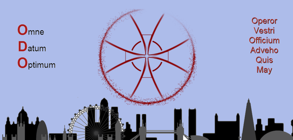
I was actually working on something similar Awol.. will post later. Busy day today!
Artworking the new site
- 54 replies
- last reply by Killings June 11, 2016
-
-
Very nice AWOL-Vinci 😀 Nice coalescence coming 🙂 I'll work on your ideas later. I'll take on board what Aerilon-Avagio comes up with as well 🙂 When Cult-Ochelli posts his latest I'll watch with keen interest.
-
How do other people feel about it? If everyone thinks it's not quite right then we might be better to know now!
-
If we are into throwing opinions around already, I'll try to squeeze mine out tomorrow
-
I was thinking less about final decisions, more about if we're heading down a path which lots of people dislike, then it's better to look for other paths.
We've not really got significantly different types so far, just wondering if there was any other different approaches on offer 🙂 -
Why I like all last pics o,O
u guys gonna work together? In my opinion i prefer something clear, not overloaded.
I wonder if you are going to work together because if you collect a little of each pic can get something great! Awesome all rly -
[center]My personal preferences[/center]
I would prefer to keep the city scape to London or UK if it' hard to stretch London alone that far. This is due to symbolism of the thing, every monument of the world becomes just that and do not symbolize Templar at all. If the idea is to represent us as a global organization then some kind of light wire globe centered on Europe would be better, not the whole thing but enough to so that people see it and it can be used to outline bottom of the header on the page.
Example of wire globe

As for the logo itself I would take the base shape of background circle from crosses element of images below


And boil it down to until the shape remains like the cross in AWOL' s avatar

Or even further until the idea of the shape remains. The shape of the round crosses at it's base represents well both the Templar and round table as depending on how you look you will have the crosses or you have 8 arrow/triangular shapes in a circle.
The center I'm not sure about, a cross or shield with cross or something else. But I'd like to see it all distilled as much as possible so that it feels light and modern, or maybe I'm just fond of Scandinavian design. Perhaps the Templar red outlines of light blue background to show smurfs that we're going in on their turf 😈
Name of the cabal and motto I'd prefer in plain the V instead of U is not something I find relevant, gives it a roman feel, which I think is out place, and the last word looks misspelled.
-
Sorry Hlop, having a little difficulty following your thinking about the emblem, do you mean something like this (very quick version).

-
Yeah I misspelled converting to the "V" I have noticed 🙂
You mean cut out the centre like:
[attachment=2]ODORoundedCross02HlopJPEG.jpg[/attachment]
And add a suitably modern symbol for the centre image.
Perhaps:
[attachment=1]ODORoundedCross02HlopMOD01JPEG.jpg[/attachment]
Or:
[attachment=0]ODORoundedCross02HlopMOD02JPEG.jpg[/attachment]
-
What I meant is keeping the outlines perhaps, like in the crude example below which looks more like a flower, but hopefully conveys the idea

-
That's pretty hlop! I like the way the red shades to white from the top corner 🙂
I wonder what it would look like to have the arrows being convex not concave - might look at little less flower like maybe...
This gives me ideas, I will play with them when I get home - out atm 😀
-
Well it seems like it's hard to make what I'm looking for to look like anything other than a daisy, at least I have not managed it. A couple of not daisy like experiments. I have not done anything with AWOLs cross as I have not even managed to make the back of the image to work as intended


-
Not sure about the blue, but it was quicker to work with hlop's colour scheme! Just in terms of a layout, instead of doing wording in one line, emphasise the ODO, and keep the motto visible.

-
I was mucking around with Hlop's blood splatter logo, and thought we could do some interesting stuff with it in a video - the test video only has a zombie in it, but this could easily be bosses n stuff, just need to get some more footage with no ui.
www.dropbox.com/s/f5qtfnhi1eyam7v/tsw%20test%20video.avi?dl=0
-
Yeah interwessing AWOL-urosawa. 🙂
-
I like the idea of using the logo as a gun sight - I think it works with the idea that we use loads of guns as well as melee weapons. Ideally, I'd say animating the first cross out to Hlop's splatter one would look great, and possibly best left up to people with better art skills than me 😀 If not, I'm sure I can work it out slowly (hell, I know how to do it, but I suspect other people would produce a higher quality product).
-
Since this thread got very heavy, I have moved art entries from different people to their own threads, so that they do not get lost. This thread now contains general discussion, not related to one person specifically.
So if you want to suggest art for the site, make a new thread for it and one of the moderators will sticky it 😎
-
Another brain puke
[attachment=0]Honey shield.png[/attachment][attachment=1]Honey cross.png[/attachment]