Another brain puke
[attachment=0]Honey shield.png[/attachment][attachment=1]Honey cross.png[/attachment]

Another brain puke
[attachment=0]Honey shield.png[/attachment][attachment=1]Honey cross.png[/attachment]
[attachment=5]Honey shield1.png[/attachment][attachment=4]Honey shield2.png[/attachment][attachment=3]Honey shield3.png[/attachment][attachment=2]Honey shield4.png[/attachment][attachment=1]Honey shield5.png[/attachment][attachment=0]Honey shield6.png[/attachment]
[attachment=1]logo1.png[/attachment]
funny atomic one
[attachment=0]atomic.png[/attachment]
[attachment=0]pure.png[/attachment]
Is too close to what I'd imagine They are imagining.
Ah, sorry, just very honeycomb/bee like
bzz bzz bzz.
meh, we're all bees, no-one has a monopoly on the idea.
"To bee or not to bee" etc 🙂
Can we please add the [s]mating turtles[/s] Sydney Opera House (or some other internationally recognised 'Australia' to the skyline? If not Australia, then New Zealand.
We're the only English-speaking/Euro-derived-culture countries in our general region, and it gets kind of lonely down here and easy to feel 'forgotten'. I suspect South Africa has a similar problem (among all its others).

Haya 😀
If yall're still in need of anything in particular, I could do some sketch-ups and get some input, and maybe do some finals. Not sure if yall're looking for specifics like, banners, icons, badges, etc. but I can def contribute 😀
Anything and everything is up for fresh ideas 🙂 I can't give any guarantees that we'll like everything (I have been told in the past that I'm an opinionated bastard, but hey, what do my wife, best friends, sister, cousins and parents know, right?).
We have total control over the appearance of the site, er, as long as we can work out how to change it 😀
But all and any ideas are welcome!!

Yeah have a good look at the things in the different threads, I'm sure you can pull something together from the contributions. I have tried many variations, my problem is they are probably not polished enough. I've only really been doing "serious" computerized imagery since April, with varying degrees of success.
A small snapshot of what we are looking for:
Modern Templar over the old guard. Crosses of varying designs. Shields maybe weaponry?
Not too dark, yet not pixies and faeries.
Maybe something incorporating the round table structure of the Cabal?
Lions?
Incorporate the motto "Operor Vestri Officium Adveha Quis May" of the Cabal
Other Mythical beasties?
Heraldic motif maybe? But then it has to have a modern reflection.
We've used London City Skylines at points.
AWOL has worked out a preliminary cross design as a Cabal logo and given plenty of ideas. CutOfXtc and Aerilon have put some ideas in as well. As has RichardRahl. I've done some icons etc and posted a fair bit. Forgive the early stuff 🙂
That's a snapshot really.
Just to add btw, don't feel you have to look through stuff at all if you think you have an idea. One of the things we discussed was that it'd be interesting to get a totally fresh perspective on everything, rather than us just rehashing our same ideas.
Don't be afraid to try anything out 😀
I just looked at submissions, and read the reviews, and ideas everyone else had that they inspired. I have some ideas for sure. Are their metric particulars for banners, icons, etc.?
Er, probably... The one I know about is 27 px square for icons. I think we can be pretty adaptable when it comes to layout and stuff (Hlop may correct me here).
We can change the phpBB bit fairly easily, the wider page may take a little bit more work.
It's possible to do a test run on the forums, if you go to your forums user control panel, then in board preferences you can select different board styles. The calendar part uses EQDKP+, which is still very versatile, but i'm not sure how easy it is to change stuff without there being wholesale changes to the site.
there are no limits as far as I'm aware, the styles can be changed on both eqdkp and phpBB, changes can be significant. But if we have to go into php code and stuff then we'll be dealing with mod we have to reapply after updates, making updating more difficult.

OK- need some dimensions- I would suggest stuff like this in the sticky so everyone knows what to work with.
Dimensions in pixels:
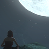
Body: 2460x1250 Image: http://omnedatumoptimum.red/data/f7a48ad919089dbde9c98daeba98749c/files/system/test%20backgrounds/Blue-mountain-shore-mod-02-447.jpg
The pixels per inch on what is seen on this image- is only around 1345x815 at 16:9 ratio. Not a lot to work with considering the image used is HUGE- thus making it look low quality and terribly zoomed in. I'm afraid to work with it like this- it needs adjusted.
Other Stuff-
Header:
Footer:
Left Aside:
Right Aside:
Content:
Middle Content:
That picture's a screenshot with a filter placed over it, rather than being a piece created from scratch, which is one potential reason for how it looks.
Previous art we've used (which was just generic tsw downloaded from eqdkp) had:
header: 6520 x 771
background: 1067 x 600
For the other sizes you're asking about, honestly, I don't know. A lot of this is currently done by trial and error as none of us have much experience with editing the relevant code. We know it can be done, but part of the issue is that there is so much which can be done, it's like trying to find an ant in an anthill - and you aren't exactly sure which ant you're actually looking for to begin with.
We can (relatively) easily stick with the current overall style which we have, and change pictures, colours, icons etc. Alternatively, if anyone is up for doing concept art, we can then (hopefully, using lots of tutorials ^^) take that and create a completely different look for the site. We know that big changes can be made, as there are lots of different examples out there where people have done stuff before. Currently though, we're a little bit unfocused in where we want to be going with the design.
OK I will work on 1920 x 1080 backgrounds for submission and put them on my thread. I noticed you said a more lighter feel was better- so I will go with a red, blue and white composition for starters- matching what you already have- maybe go from there and take suggestions..