Soooo...with the new site in the works, the officers and standard bearers have been thinking some things over, among others potentially changing the ODO logo on the website (the big 3 factions emblems layered over one another that is on the front page, top left) and on Discord (the server icon). Reasons why:
Discord: the current one has a lot going on, it's meant to be the 3 factions emblems within the 3 letters, but it's scaled so small that it just comes off as a lot of texture on a small surface. Maybe we could use something clearer and simpler.
Website: similarly to the Discord one, is really flashy and has a lot going on, but more importantly, we've heard back that even though it's supposed to be representative of a multi-faction cabal, the templar cross in front is too pronounced. So far, the general feeling among the officers regarding the look of the new website has been, and I quote: "Keep it extremely simple stuffed with simple and with minimalism gravy" (because we're good at words), so that means something as fancy and flashy is just not going to work.
Here's the kicker. Bri got bored at work and whipped up some options that are not bad at all, but I'd like to hereby ask for any other submissions for the website logo - so if you get bored at work and have always felt like being a graphic designer is all you ever really wanted to be, share it here! We were thinking it'd be cool to ask for submissions (in the form of even a sketch or ideas, to avoid anyone having to put too much work into something that might not get selected) and then put together a shortlist that we could all vote on with a poll on the website to select a new logo. The only thing you'd have to keep in mind is the extremely specific guideline of "minimalism gravy", not pronouncing one faction over the other and keeping in mind that preferably the logo should look clear no matter the size - i.e. tiny details might just look like random texture when scaling the logo down.
To get the ball rolling, I'm attaching the ones Bri did:
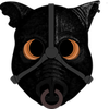
(1) This is the one we're currently thinking for Discord, since it looks good and clear small, it's already round and fits into the allowed space and shape neatly. But of course if you think it's hideous or you have an idea of your own, please share.
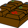
Other ones were meant for the website logo (I think, although (2) would work for Discord, too):
(2)
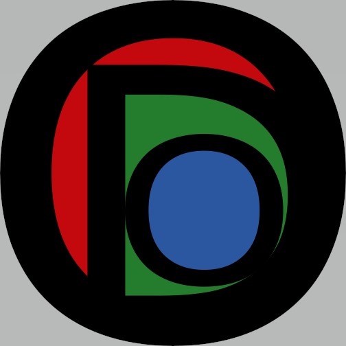
(3)
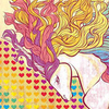
(4)
(5)