Vector versions of combined factions (I still don't like this idea, as it is generic af):
Faction icons:
Just colours:
Vector versions of combined factions (I still don't like this idea, as it is generic af):
Faction icons:
Just colours:
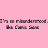
The bunnycorn is cool, to me, but I think it's a little too inside-jokey, too tied to one specific player vs. the cabal in its entirety (what about the rest of us, huh?) and would be a "wtsf" without context - i.e. I like it, personally, but I'm a little hesitant on whether or not someone who doesn't know the reference would, vs thinking it's just "oh, would you look at those guys trying to be edgy". I like both the coloured options you posted, though. The plain colours one is easier to read. It may be generic in terms of meaning, but the design is still cool and unique to us. Let's not overthink it.
Cayr, tell me the story behind any logo of a company/cabal/gaming guild out of the blue ;) - I don't think it's important.
As for bunny - fortunately or not, it's not just TS, many others picked up on the trend. I created the first thing that came to my mind when I thought of ODO that was not the templar cross. I'd personally like to have a non-generic, ODO-only logotype, mascott, something... that makes us stand out, something that says ODO, and not just multifaction cabal in SWL. Take a look at WoW guilds and their logos - they don't copy horde/alliance allegiance, they are standalone designs. That's why I went for something else :).
We could always go with penguin, bunny penguin, bunny penguin-corn, or whatever else seems like a good idea :). I just reeeeeeeally don't like going for the plain, generic idea, even if it looks cool ;).
We need to keep in mind though that it's not just what the officers want. Whatever logo options we end up with, we should just make a shortlist of whatever looks okay scaled small, therefore being suitable for all purposes, and then have a public poll/vote.
Sure. But while we're at it, we can create something different. Ideas? Any animal/object or other symbol comes to mind? Doesn't have to be an inside joke, we can start using a logo and let it grow on us ;).
what about something totally different, like an assault rifle crossed with a hammer and then a flame above it?
Couple of ideas I've been discussing with @Taishaku , the d9 doesn't work out too well, quite like the dice though! Probably need to tweak the faction logo sizes a bit more though 😁
the problem with the two dice would be that the icons are square, so it'd have to be even smaller than normal to fit in the width
I like the d9 one better, just because it's more compact in general. But what if instead just faction stuff, one of the sides was let's say the coloured ODO lettering logo, one was a bunny head, one was the orochi logo...or whatever. So it'd be sort of a mix, instead of purely factions/npc stuff? And it'd combine the lettering for ODO as well. It might get lost on it, because it's so small, but tbh if we're headed that route, everything is going to look super small and fairly indistiguishable on the scaled down version.
I myself am still partial to the colured in lettering. Nice, simple, clean, bonus points for artsy-fartsyness.
bump. Has anyone had any bright ideas? :D

I like both the D9 and the two d6s but the Orochi symbol does not make sense in my opinion, since [spoiler]Orochi does not recruit willing bee agents. They just "buy" them off of Hive.[spoiler] And that's why including a Swarm related symbol instead of the Orochi symbol could be better.
My opinion: logo is supposed to be simple, clean, scalable and easy to recognize for others. This is the up to date approach (more or less 5years give or take). For reference, I can encourage looking at Pinterest while searching for logo design or something like that. I highly dislike overcomplicated designs, and such are the dice for me or the current discord one, which is hard for me to decipher or appreciate.
As for one / two issue. Usually there is a logotype - a full logo, all the text/name etc. plus a logo - simplified part of the bigger, sometimes more complex thing, like just the icon, part of the icon, simplified icon or the first letter of the name. Could be done.
... votes for the dice, #5.
I agree. I see absolutely nothing wrong with having two similar or somehow connected logos if it meant that in their respective contexts, both would be optimal. If we wanted only one, my vote would go to the coloured in lettering, as it's a nice clean design that looks great no matter the scale. My issue with the dice is mostly same as Bri's, I think it's a little too much when scaled down. However, if we wanted to go that route, the dice would still need some sort of an ODO-refrence, not just faction emblems, so what we could do is put the coloured in lettering on one of the more visible sides of the dice (let's say on the black dice, instead of the Dragon one) , then use the dice on the website and just the lettering on Discord. It wouldn't be two different logos that way, as the one on Discord would just be a part of the bigger one, technically. Hope that made some sort of sense :D
I think one of the questions is about how & where we'd use a big picture tbh. I suspect that even dropping to one D6 would mean that it'd still need to be pretty large to be able to make out details like the lettering on the front face. I quite like the idea of it, I'm just not sure where we'd be using it though.
AWOL or Bri, would either of you have time to conjure that up just so we could see what it looks like? The places we'd want the bigger and fancier dice version would be somewhere on the website header and then maybe as profile pictures or headers on whatever recruitment posts we have out there.

Not thrilled with it, but tweaks could be made. The black lettering won't show up on the black dice, though that could be changed - hell, could have the faction colours on dice faces, but it then becomes the question again about what goes on other faces.
Eh...yeah, kinda hate the white tbh. Maybe a thin outline around the black outside circle would work better? Doesn't have to be white, I find it a little too contrasted, but maybe dark red? And the top three faction things together are fine, but on the side, everything gets muddled and lost, I'd just keep the Orochi logo.